Friday, July 27, 2007

Unicarrot


Unicorn head from fantasy.lacefairy.com.
Unicorn brush modified from unicorn clipart from webclipart.about.com. Blue patterned paper from DesignerDigitals.com. Unicorn letters, circle ribbon, and corner flowers from Scrapgirls.com “refresh Biggie Kit”.

Pretty


I found this site, valsketch.com, that has a bunch of templates and this layout was from one of them. All the papers and embellishments came from youniquephotos.com. It was quick and easy with the template to guide me and a digital kit to keep things matchy-matchy.

Peek-a-boo

I carefully cut out this picture to make it seem more 3D. All of the papers and embellishments and actions came from atomiccupcake.com. I love that site.

Grunge Peas


I created this paper using clipart I downloaded from WPClipart.com. The quote came from quotegarden.com. The journalling tag came from youniquephotos.com. The scalloped paper edge and the grungy border mask on the picture all came from Jessica Spragues tutorials. The dirty little girl... well she accomplished that all on her own. MMMmmm Peas!

Friday, February 23, 2007

Recipe For Love


This all started when I scanned some pages from a recipe binder then altered them to make dividers and cards that I could use for scrapbooking. Here's more of my wedding photos taken by Lenore Farrell. Background paper came from Katie Pertiet WebFree9306Prev, designerdigitals.com. Decorative borders on red divider cards came from Dana Zarling, web freebie title stamp clean and grungy 9-24-06, designerdigitals.com. Decorative border on bottom left photo came from designfruit.com, Valentine brushes. Title font on recipe card and dividers 'The King and Queen' from daFont.com. Vellum paper around recipe card was developed from Andrea Victoria Web Challenge Freebie 1105, designerdigitals.com. The brads were created with photoshop styles.

Snow Angel


I took this photo of my little girl beside her first snow angel. Isn't she precious? Jessica Spragues tutorial on brushes helped me to create the snowflake effect over the top right corner of the photo. The angel clipart came from wpclipart.com. I made the pattern on the blue paper using photoshop custom shapes. The fonts are 'The King and Queen' and 'Snowfall' all from daFont.com. I made the background paper by creating a pattern from the words 'snow angel'.

Newly Wed


Here's another Jessica Sprague idea. The tutorial showed how to pop out the focal point in the photo in that little circle. I got the clipart of the daisy and the rings from wpclipart.com. The paper is called 'Clara's paper' and came from cottagearts.com via the book 'Digital Scrapbooking in Easy Steps'. The brushes came from designfruit.com, fresh foliage layers. This is one of our wedding photos. The photographer is Lenore Farrell.

Water & Wind


I got this layout from Jessica Spragues website, http://spraguelab.squarespace.com/. She gives tutorials every Friday on Photoshop so I usually come up with a page a week to help me learn those techniques. This one was all about the custom shape photo in the centre. I made all the paper and elements myself using photoshop brushes and filters.

Tuesday, November 14, 2006

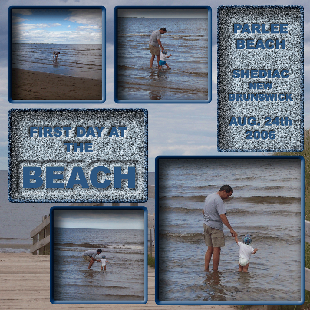
The Beach

For these scraps I used the same background photo but altered it slightly each time.
I also chose to 'mount' the photos differently for each layout.

For 'Cold Day' I darkened the top and bottom of the background using a gradient application. I beveled the photos with a smooth edge and put a drop shadow.

The background 'Independance' is unaltered. The photos have a sharper bevel and a lighter drop shadow.

For 'First Day' the background actually appears to be more of a foreground. I applied inner drop shadows and edgings to make it seem the foreground has been cut and the photos placed behind. I also applied a texture to the text blocks to make it look like sand. Then I applied an embossing style to the letters to make them appear as though it was written in the sand.

Cage Match


This picture was taken the last time we visited dear friends - then their lives got crazy busy. So I did this scrap so the girls could have a memory to share.
I tried to make this look like an event poster that you might see posted downtown.
Was I successful? I used different layers with varying opacity and I applied styles from the softwares menu to the images as well as the words.

First Birthday


Happy First Birthday, my little monkey!
May 22, 2006
While out for a walk one day, I took pictures of various "textures". The background for these layouts is from a picture I took of a stone walkway. I made all the photo edges appear to be etched into the stone. The photo of baby within the "O" of the word "one" was a bit time consuming. It involved several layers, extracting, and erasing. I got the idea from "Digital Scrapbooking Magazine" but there weren't any instructions for this one. I had to figure it out for myself. But I think it works.

First Year

Okay, so I got a couple out of order. These are all scrap pages I did up to just before her first birthday.

This was a pile of totally useless photographs - from the regular photo album point of view. In trying to catch a pivotal moment with my daughter that I could send to her grandparents far away, I managed to document an event. I combined the pictures on one layout and used colours from the background photo to edge the thumbnails. It was a quick and easy scrapbook page. But I get comments from people about how it really tells the story of watching her learn to stand. They say they feel like they were there. Sometimes it's best to keep it simple.

I created the background paper by using a web image of a ducky, repeating it on the page, then brushing around the stamp in an antiquing sort of way. Really time consuming. Layers are your friend!!


Slide


For this layout, I followed instructions in "Digital Scrapbooking Magazine". It was quite involved. I created the gingham paper, one strip of pink at a time. I created each cut out letter. All background colours were pulled from the original photo.

Swing


One beautiful day at the park turned into an incredible photo opportunity. A friend took several pictures of her son and our princess. For this layout, I extracted baby from a duplicate of the photo, used a radial blur filter on the original layer, then layered the extracted baby on top of the blurred layer.

Monday, September 11, 2006

iJump


The instructions for this layout were in "Digital Scrapbook Magazine". It is meant to simulate the iPod commercials. This layout allowed me to take a poor quality picture of no use (blurry) and make an interesting scrap page. It was time consuming, extracting baby from the original photo, but I think it was worth it.

Happy Birth Day


Happy Birthday little Monkey. You are my precious miracle. If anyone ever had any question, you are proof of our loving God.
For each photo, I extracted baby from the original, then laid it over a background with a silk style. For the larger picture, I included a layer of the complete picture in a reduced opacity. You can just make out the sheet and tubes around baby's body.